Design systems · Design thinking · Information architecture · Design strategy
Unifying EVERFI’s card components
Outcome
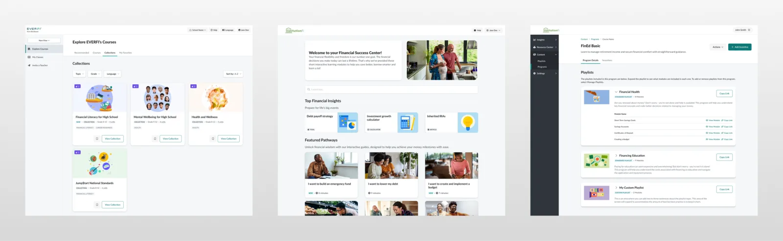
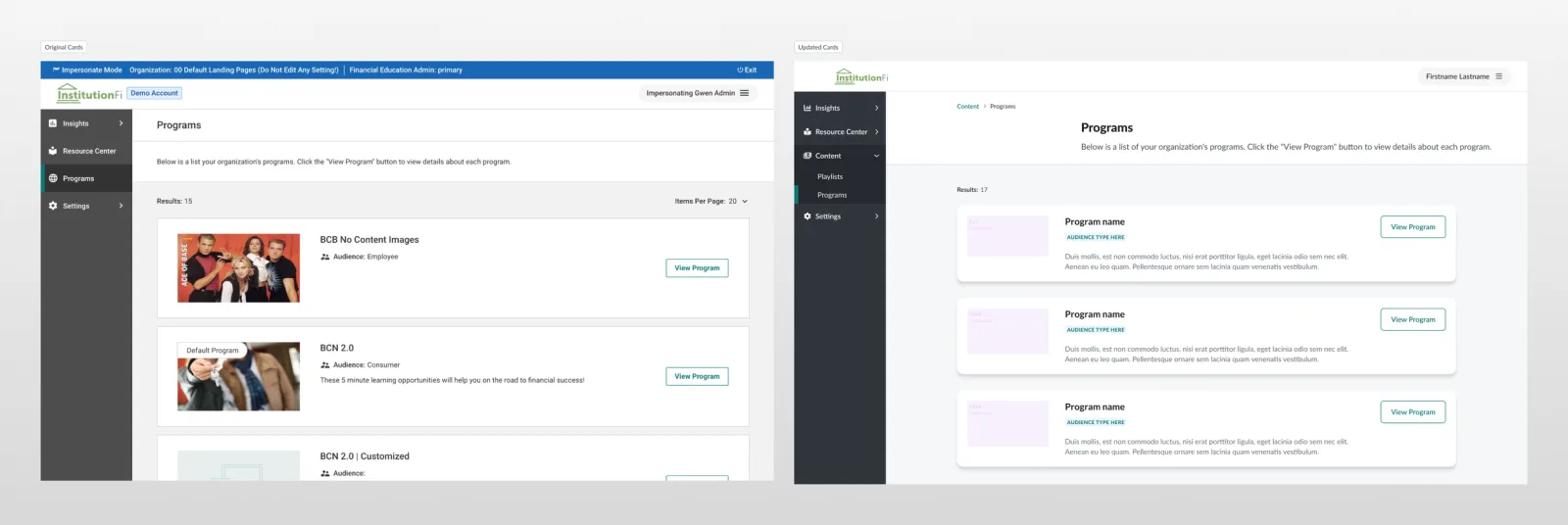
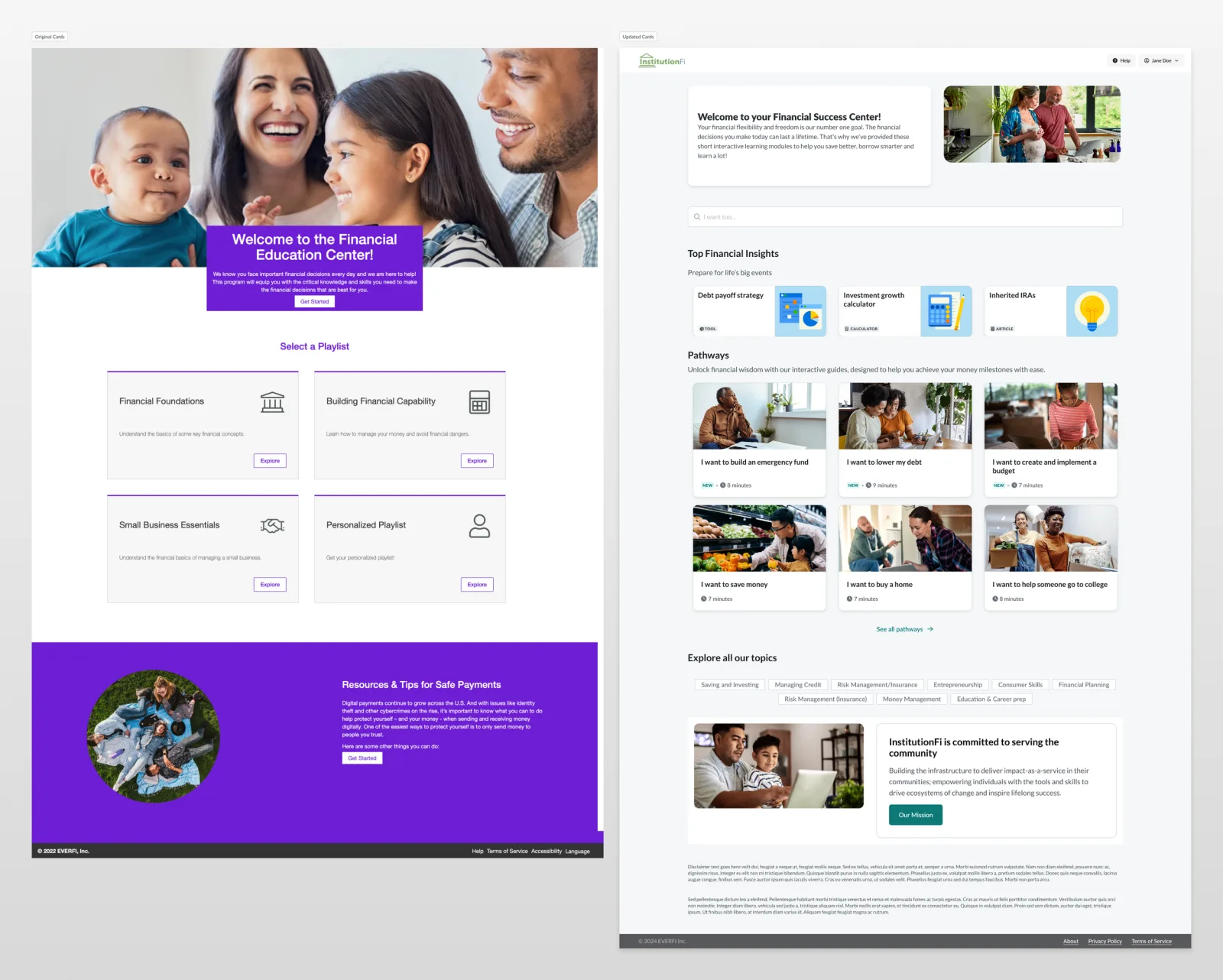
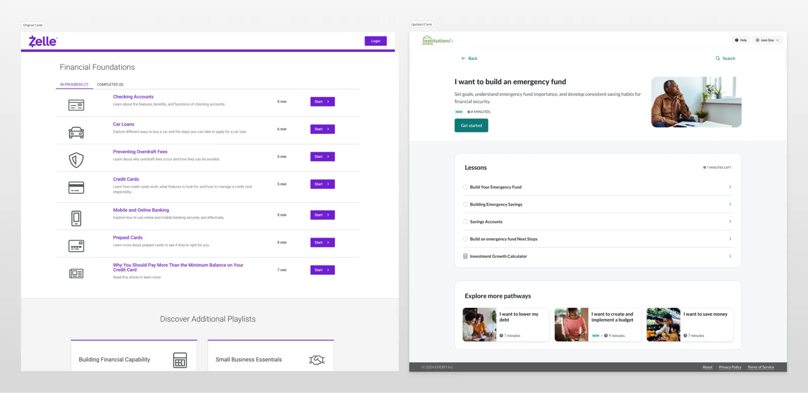
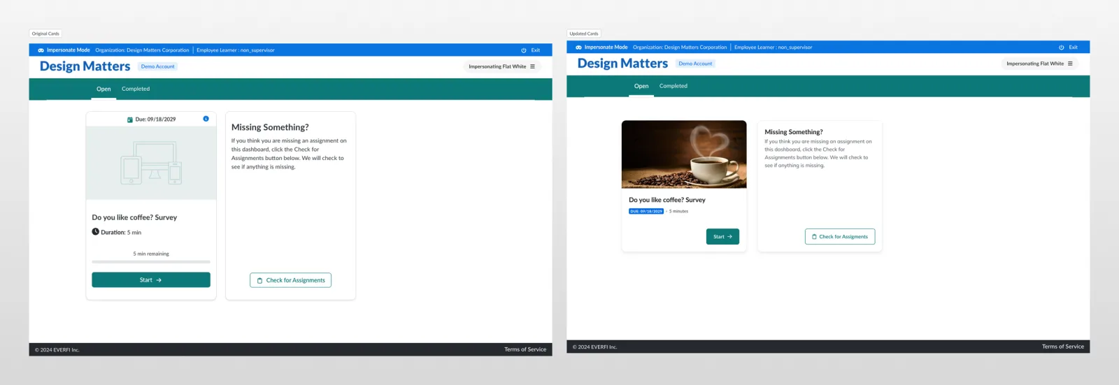
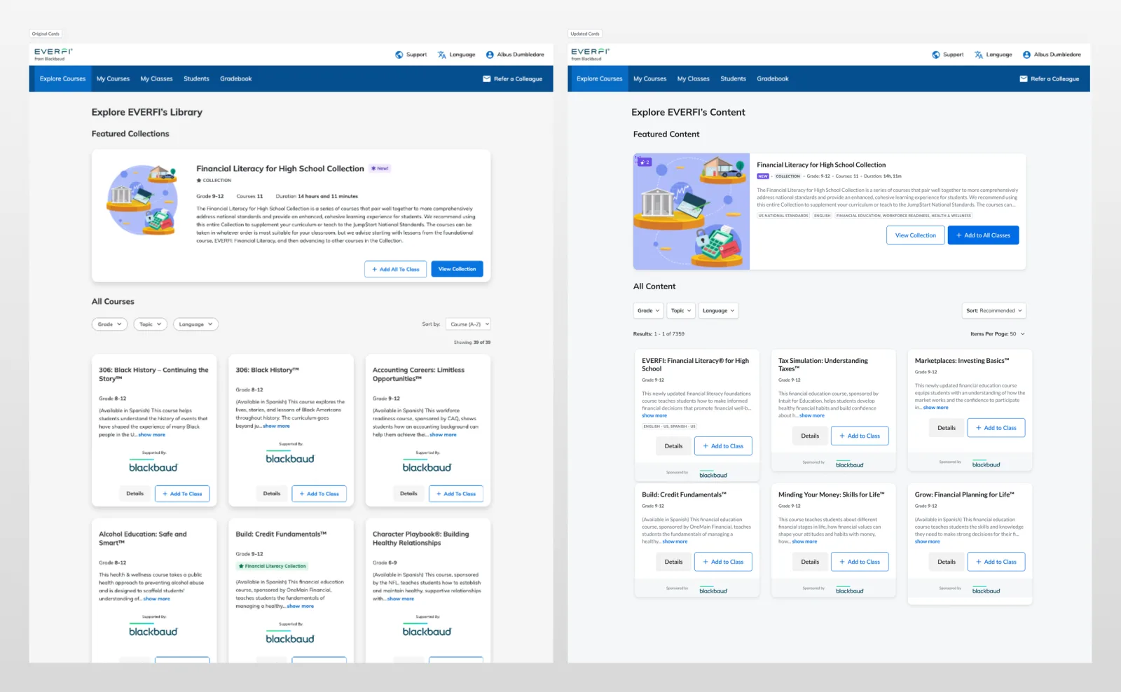
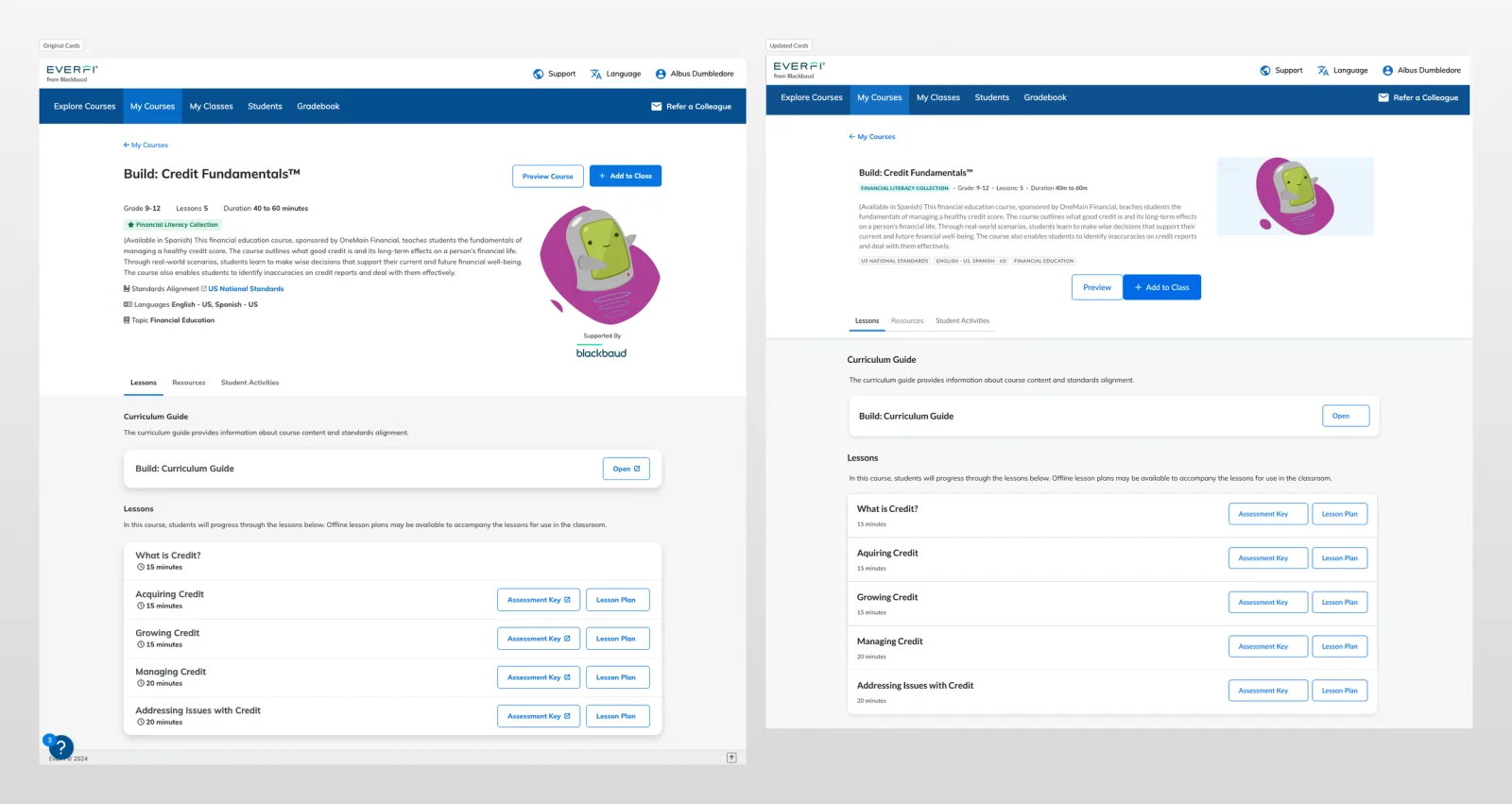
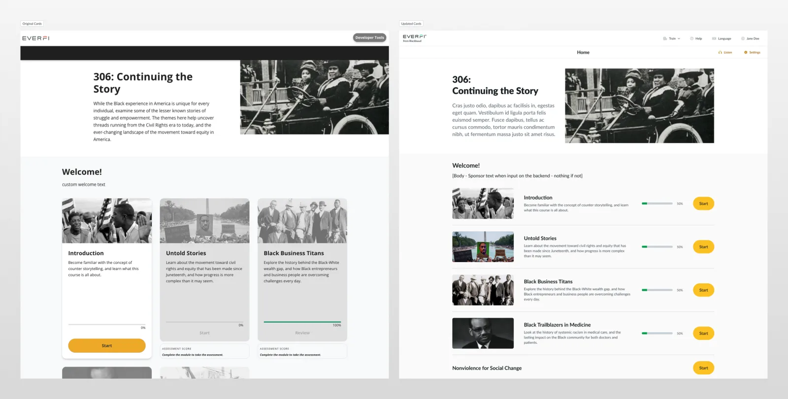
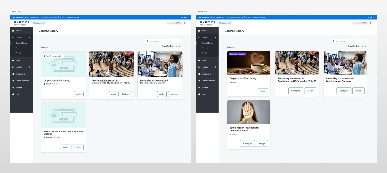
The outcome of this project was a standardized card component that unified the visual experience, improved user interaction, and streamlined the design process by establishing clear standards and best practices across EVERFI’s products.
Background
EVERFI is a leading ed-tech company that delivers critical skills education through SaaS solutions across sectors including K-12, elective learning, financial education, and workplace training. As new products emerged over the years, some inconsistency emerged with them — particularly in our card components.
The challenge
Create a responsive and versatile card component that can be used across all EVERFI applications, unifying the user experience and improving usability. The component needed to accommodate different content types, metadata, and use cases while staying scalable and accessible.
Problems to solve
- Inconsistent card designs — multiple versions of card components with differing styles, sizes, and interactions across the platform were causing confusion.
- User difficulty — users had trouble finding the right information on cards because they had to relearn card structures in different parts of the platform.
- Lack of standards — no defined best practices or guidelines for card component usage.
- Maintenance challenges — lack of standardization made it difficult to design new experiences across the platform.
Solution
Align around an intentional design language: create a unified card component and establish best practices for a cohesive visual experience across EVERFI’s platform and products.
Guiding principles
- Consistency — every card feels like a family and behaves predictably.
- Accessibility — align with current WCAG 2.0 standards.
- Flexibility — support various sizes and data scenarios across EVERFI’s products.
- Scalability — design with future growth in mind to accommodate new metadata types.
- Collaboration — involve cross-functional teams to gather insights and needs.
Discover & define
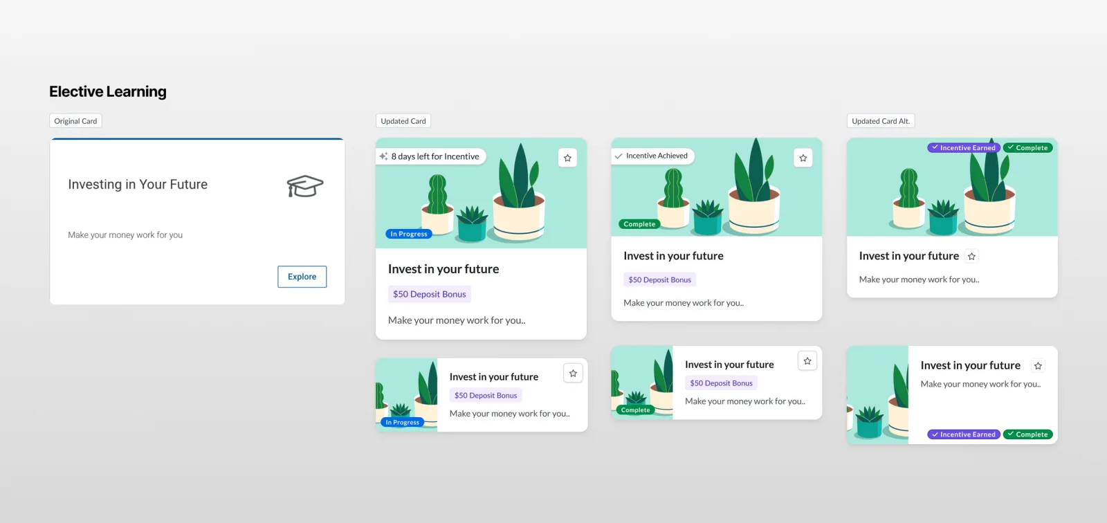
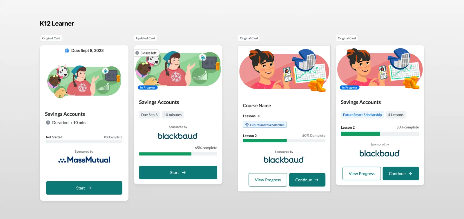
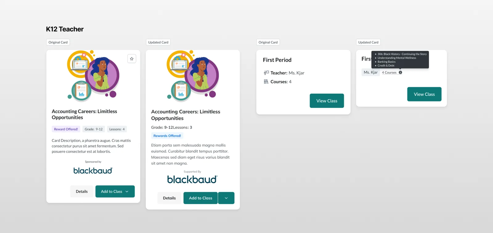
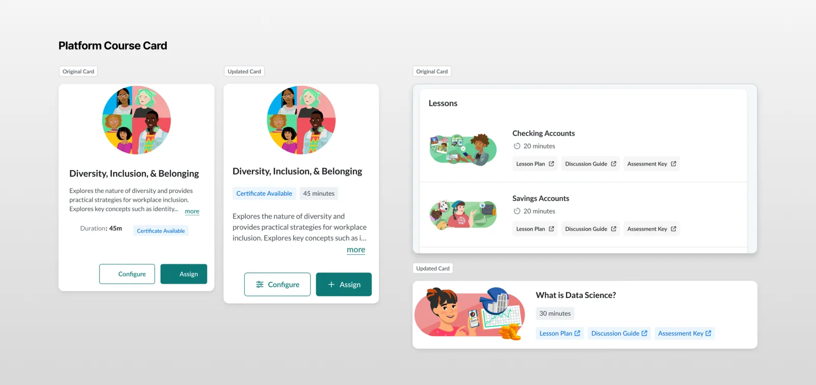
My first step was to fully understand the landscape of our existing card component with a targeted audit: cataloging where the component was used, how, what information it displayed, and the variants needed for each product. Working in Figma, we built a repository the whole team could collaborate in and reference going forward.
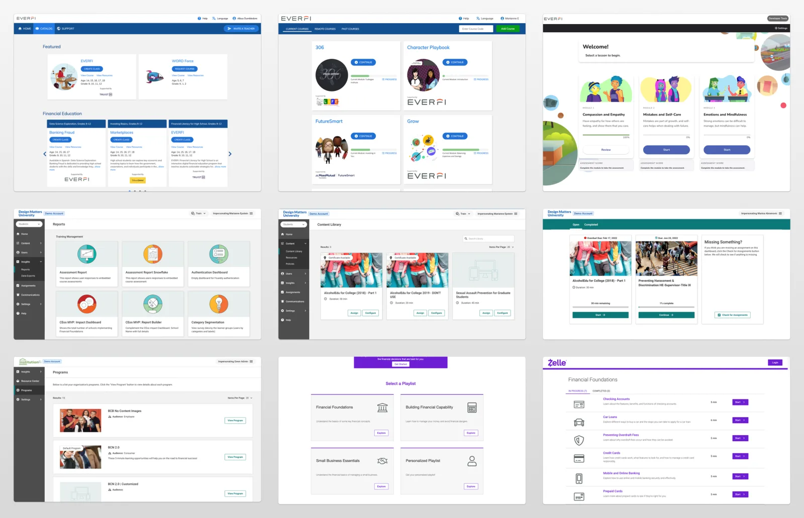
As part of the working session, we looked at industry standards for card components — tags versus badges, image ratios, card orientations — and how to communicate the desired messaging and metadata successfully.
Early exploration
After cataloging our findings, we moved into ideation using Figma and FigJam, holding collaborative workshops to brainstorm and challenge different ideas.
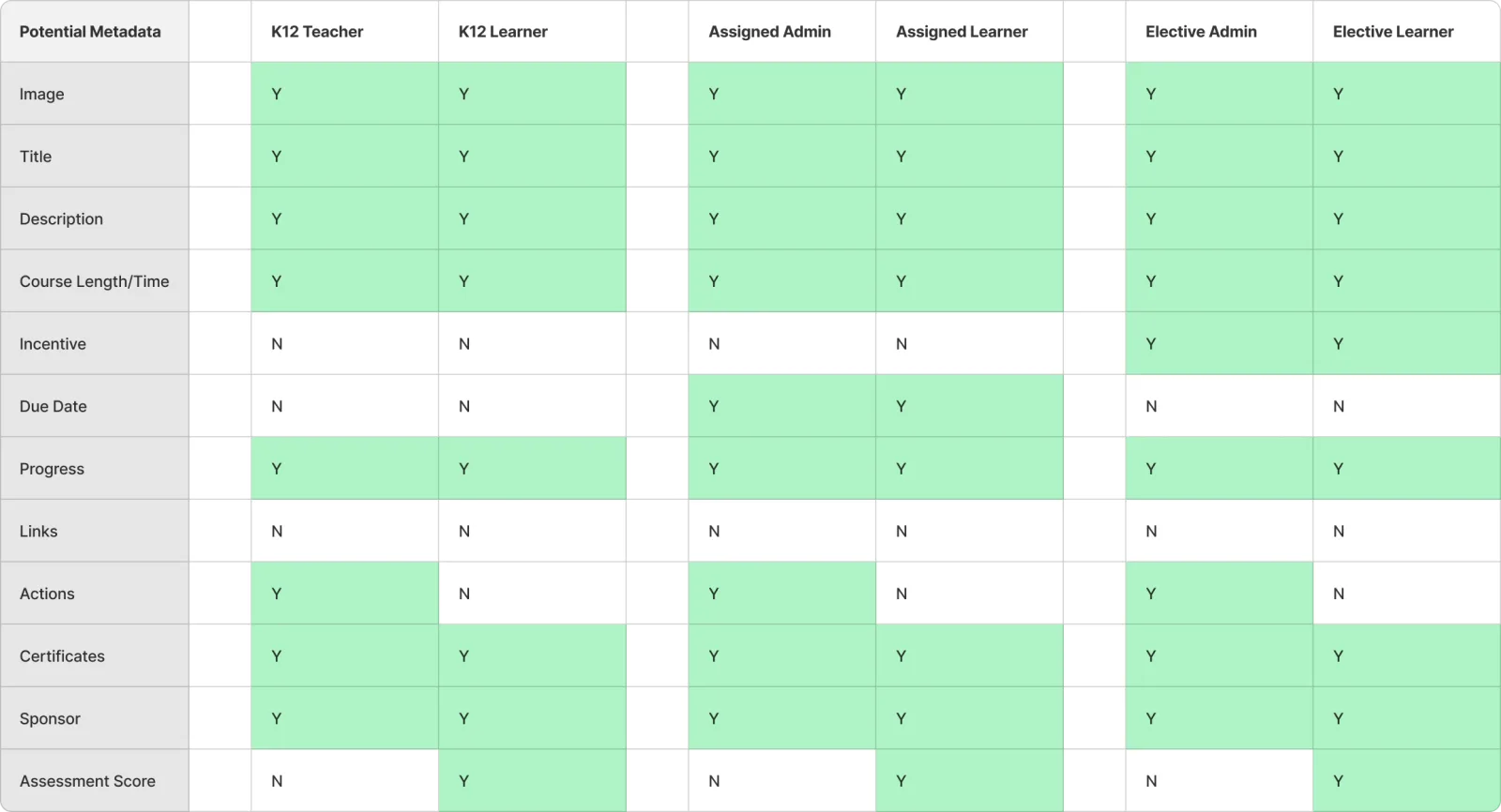
We had deep discussions about metadata arrangement: establishing a common language for tags and badges, when to use them, and how to build a clear information hierarchy — plus visual elements like image ratios and card orientation. Each session built on the insights of the last.
Design & iterate
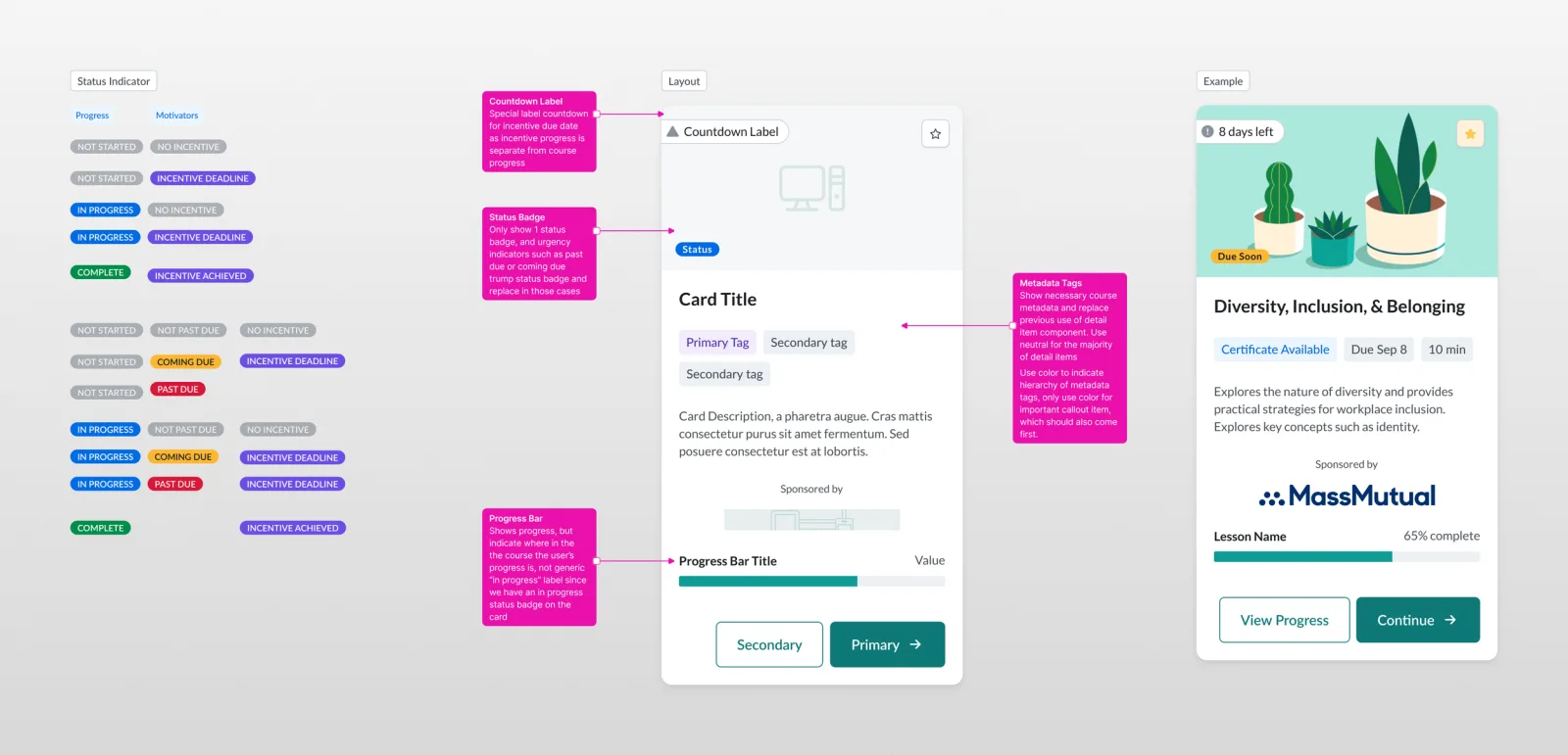
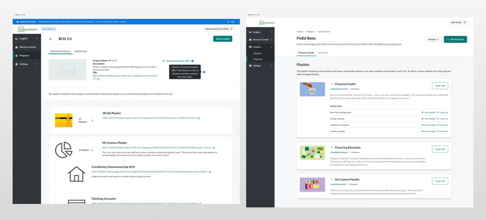
For the proof of concept, we developed several card variants in standardized sizes (narrow, medium, wide), each with predefined metadata configurations for specific use cases — consistency with room for flexibility. We then mocked up the screens and cards collected in the initial audit; seeing the components in context across different use cases was invaluable.
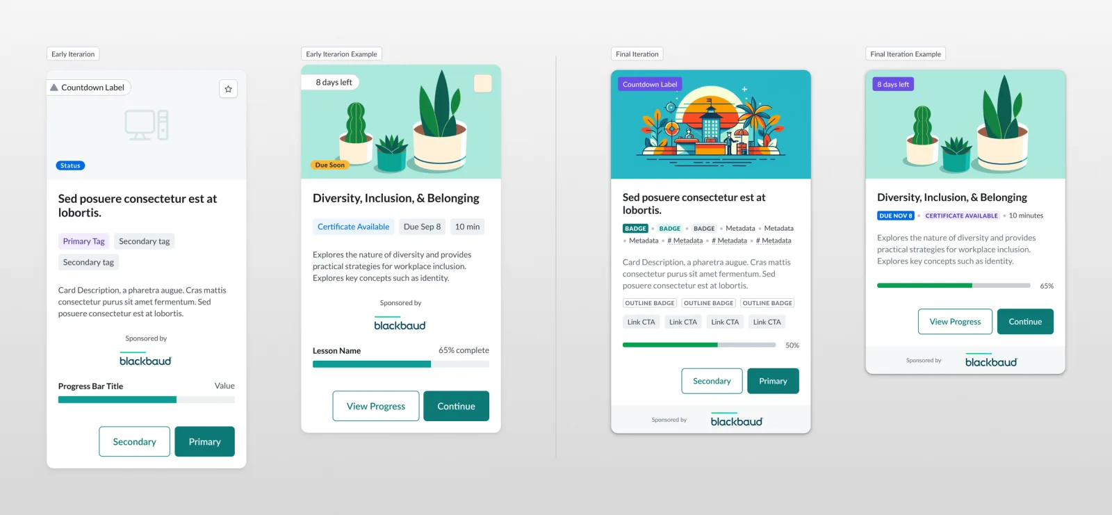
We established responsive design principles so cards would display effectively across devices and screen sizes, and defined clear rules for primary, secondary, and tertiary metadata to help users prioritize information naturally.
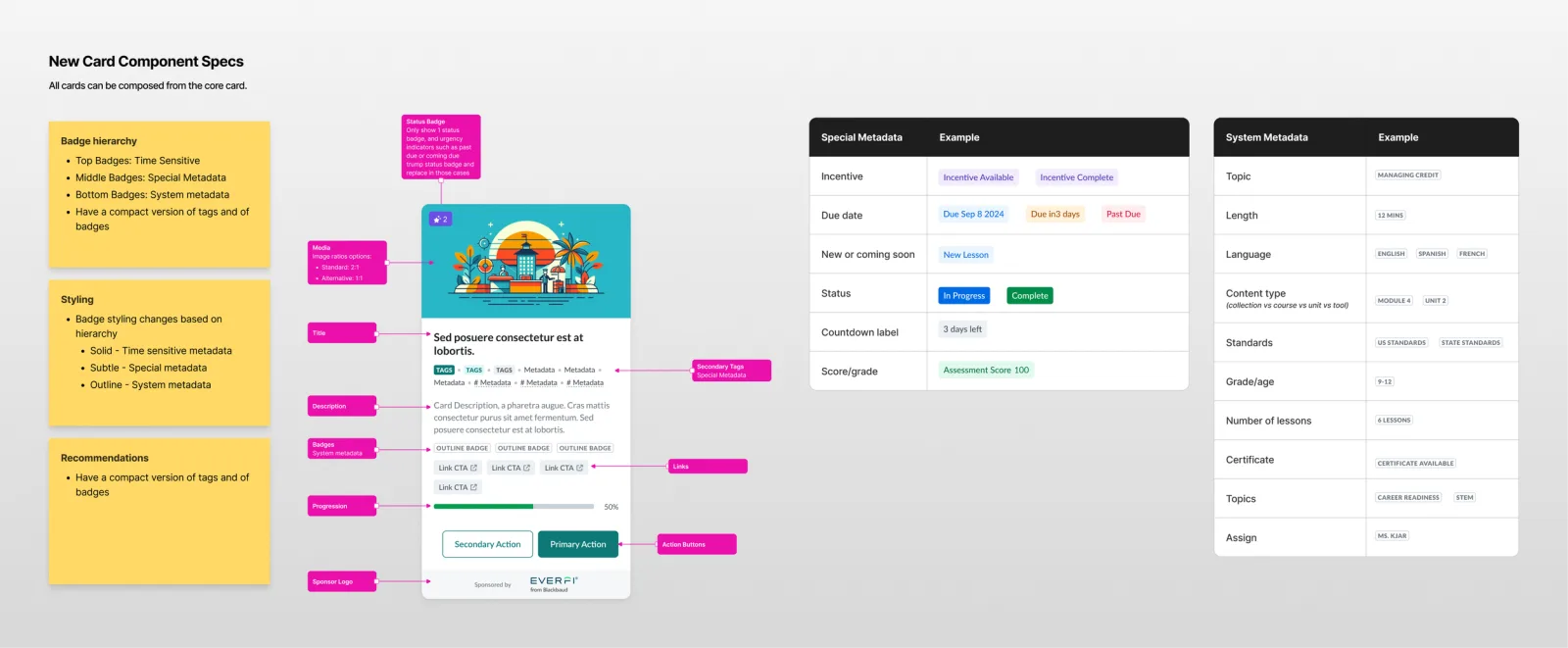
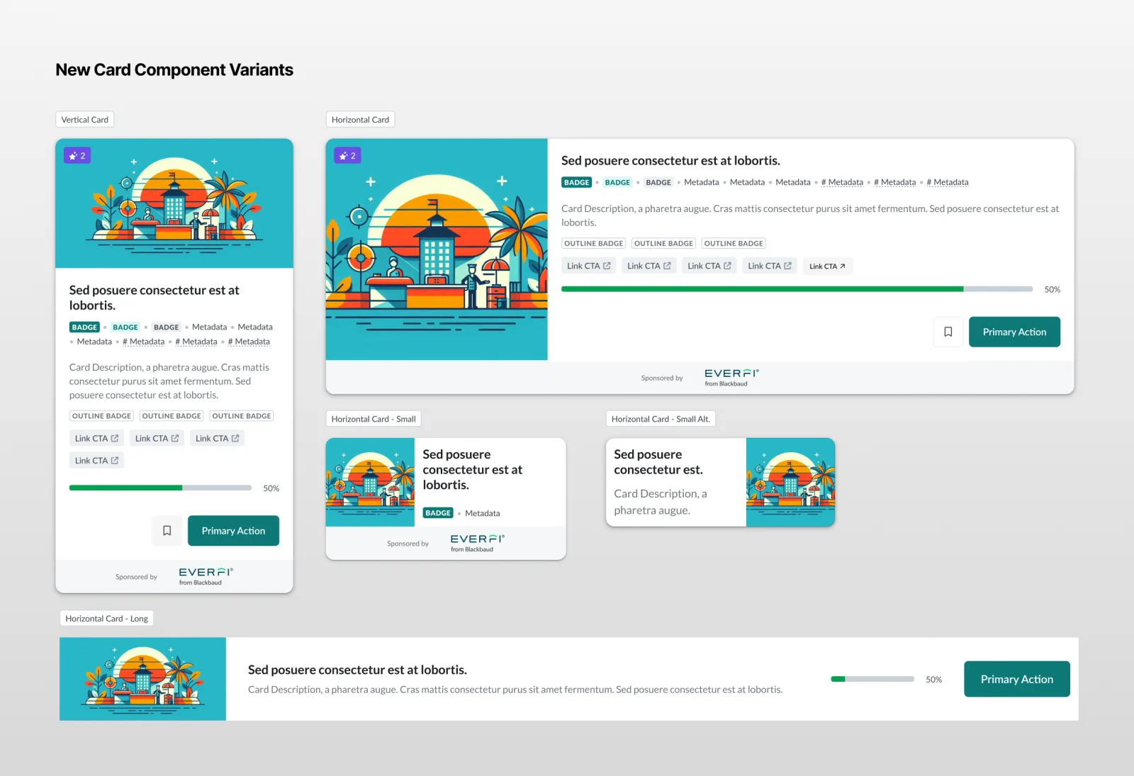
To ensure consistent implementation, I built a Storybook.js specification as a single source of truth, documenting visual design, metadata hierarchy, variant/orientation options, and edge cases.
Key results
- Improved user experience — users found information faster and navigated the platform with more ease; the new metadata hierarchy reduced cognitive load.
- Positive feedback — initial testing showed higher task completion rates and satisfaction with the clarity of information.
- Design efficiency — standardizing the component cut down redesign work, freeing designers to focus on other parts of the experience.
- Enhanced collaboration — stronger alignment between design, development, and content teams, with open channels for future issues.
- Scalability achieved — the component is backwards-compatible and can be integrated into new products seamlessly.
Summary
This became more than a design update — a strategic overhaul that addressed fundamental platform issues and advanced our Unified Design Library’s goal of a cohesive interface experience. By applying systems thinking and involving cross-functional teams, we created a scalable, accessible card component built to adapt to future needs.
Lessons learned
- Value of routine evaluations — regular audits of design components surface issues before they grow into bigger problems.
- Importance of collaboration — engaging every stakeholder is key to building the right features into new components.
- Documentation is key — detailed documentation keeps things consistent and gives future projects a reference point.
- Holistic problem-solving — focusing on underlying issues rather than symptoms leads to more sustainable solutions.
- Continuous improvement — a proactive approach keeps the user experience at the forefront.